
I retired recently, so I suddenly have a lot of spare time. It’s neat! I like it! And I spent a lot of that spare time during the tournament developing (vibe-coding) a data visualization app to explore some of the hidden dynamics of the cup. It’s been a lot of fun. Feel free to go play around – it’s pretty data rich.
I recently spent some time adding an “Analytics” tab to explore some of the overall dynamics of the tournament. In this post I won’t describe any inferences or conclusions I’ve made, but just focus on the decisions underlying the analytics. Note – this is more technical than I usually indulge on this blog, so if you’re not a math or tech nerd, probably not for you. Also, most of the things that sound super smart are at least filtered through Anthropic’s Claude. I’ve learned a fair amount from Claude’s data in what I can only call a collaboration; this realizes a bunch of half-baked ideas I’ve been thinking about for years, in a way that could never have happened without the AI tool to churn out code.
One usage note: the entire experience allows retroactive exploration of how the tournament looked in each stage – as the tournament progressed and weaker teams were winnowed out, the remaining teams faced stiffer opposition; it’s not completely meaningful to compare England’s seven games to Australia’s four, so the tool allows specifying which stage of the competition you want to consider. I note this only because it’s easy to forget you were looking at the Group Stage and wondering where the other four games England played went.
Difficulty: how tough was each team’s opposition?
There was a lot of conversation about how easy Argentina’s path to the final was; I wanted to quantify how hard or easy a team’s opposition was. This was a fairly easy page to build, since I already had the data and visualization built, and I had grabbed the ELO ratings for every team in the tournament early on. The sparkline represents the strength of every team in the competition, using the ELO data as a proxy for strength. That ELO proxy turns out to be pretty accurate; across 104 matches, there were only twelve upsets (an underdog overperforming the ELO prediction, details below).

The simplest approach for evaluating the relative strength of a group of teams would be to simply use the mean. Indeed, the white bar at the centerline represents the mean (surrounded by the +/- one standard deviation). However, I wanted a summary that would be stable for smaller groups that typically don’t have a normal distribution, so I came up with another approach that I think is more robust.
The red centerline is what I call the Group Strength Index (GSI). GSI is a single ELO-scale number summarizing how strong a set of teams is. It’s computed by treating the sorted ELOs as x-positions and building a single-peaked (“tent”) polygon over them, pinned to 0 at both ends. The y-values (heights) are established to make the polygon’s edge lengths as equal as possible (i.e. minimize variance between them). We then fit a curve around that polygon using a natural cubic spline and report its true peak (where the tangent is parallel), and use that as the value. We fall back to a plain average for a group with three or fewer scores, as no valid single-peak construction exists with fewer than four points. This approach doesn’t collapse toward a lone outlier the way a simple mean/stddev could: an isolated weak (or strong) team just becomes one long edge in the polygon, and the peak still lands among whichever teams are actually clustered together. 1
We can use this computation to compute the GSI for all opposition faced by any given team in the tournament. This is a reasonable representation of the total strength of the opponents, which in turn correlates with the difficulty of their path. This screen shot shows the difficulty sorted from most difficult to easiest; a notable name tops the list as having faced the most difficult opposition. Note that this does not reflect the results of those meetings; a team that had won all of their games would have the same GSI if they had lost them all.
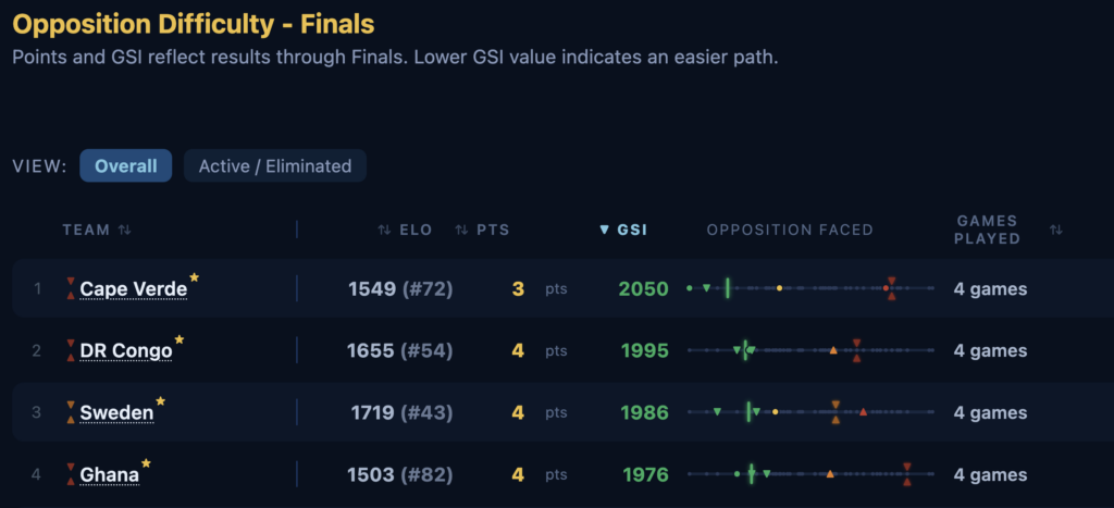
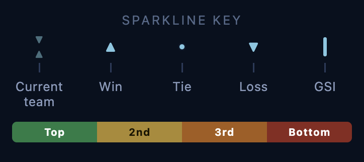
By the way, that “opposition faced” sparkline is pretty data rich; the key is below. You can see at a glance how strong the team is, how strong their opposition was, and the summary ELO for the group (including the team). In the app each of the points on the sparkline has a tooltip describing the specific game represented.
Group of Death
The GSI computation applies gracefully to large groups as discussed above, but it works reasonably well to quantify the relative strength of groups of four or more – each group in the group stage, for example. So would it be useful for predicting the “Group of Death”?
Colloquially the “group of death” (GoD) in a multi-stage tournament is described as a group which is unusually competitive, and again colloquially this is usually expected to indicate that there are too number strong competitors in the group, so someone that might qualify in another group is eliminated.2 This colloquial definition, that it correlates simply to the “strength of a group,” suggests that the GSI on its own might be used to expose it.
However, I don’t think that’s the right definition. A group with one or two very strong members, and a couple of very weak members, might show up as being particularly strong – and that would not be a GoD. Sorting simply by GSI suggests that Group I was the “Group of Death” – but France and Norway easily took the top two spots in the group. Not all that deadly.

But thinking about the relationship between the GSI and the mean suggested a different definition: the GoD is a group whose results are difficult to predict – anyone could be expected to make it out of the group.3 I’ve been describing the ELO as relative “strength” of a team, but it can equivalently be considered a probability, with the difference in ELO describing how likely one team is to beat the other. Given that “difficult to predict” really means “small difference in probability outcome”, I realized that if we do interpret the ELO distribution as fitting a normal curve, then the standard deviation tells us exactly this: how close are the win probabilities?
When we sort by standard deviation, we discover that two of the three (theoretically) hardest to predict groups involved teams from CONCACAF. Welcome to the Group of Death, United States. And congratulations for being the strongest team in your (highly competitive) group, Mexico!
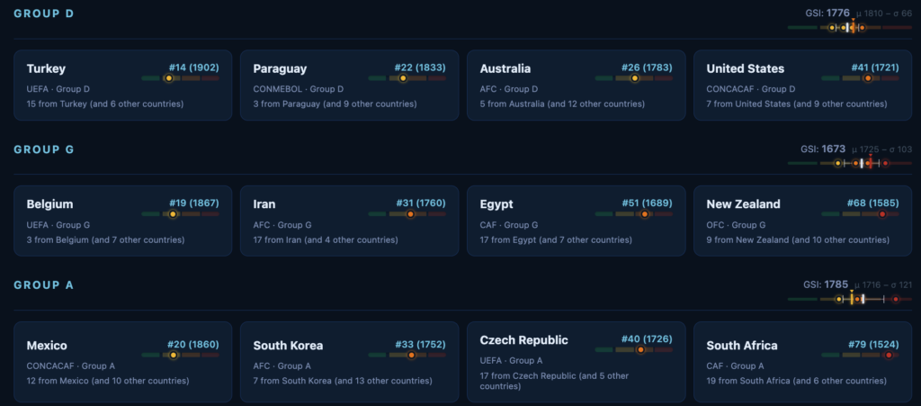
Note that Spain was both in one of the two weakest overall groups and the least deadly. They definitely had a cakewalk through the group stage, know what I mean? (What I mean is that nobody told Cape Verde about that.)
Performance: how well did each team perform?
But I wanted to know what it would look like if I did consider the results in addition to the opponent’s strength. This looks like a reasonable proxy for how the team performed: playing well against strong opposition represents better performance than playing well against a weaker opponent. Note also that there are two types of performance: how a team performed in a particular match, and how a team performed across all its matches.
Doing a really detailed, careful analysis would require a ton of detailed game data and a ton more work. I believe I mentioned that I’m retired, so I have some time – but not unlimited time. I wasn’t going to try to find those detailed player stats – the people who do this for a living have massive datasets about positions on the field and velocity and so on, and I don’t do anything for a living. So I wasn’t going to do a really careful analysis; instead, I figured I’d do an awful, terrible, but not entirely fictional approximation using only the data I already had on hand.
Match Performance
I’ve already been leaning pretty heavily into the ELO for this app, and the ELO formula updates its rating after every game. Oh, and look at that; the ELO formula is published and comprehensible. What if I just used that?
The approach basically asks “how many points would this one match have affected that rating?” The published formula from eloratings.net: Rn = Ro + (K*M+G)*(W – We)+, where:
- Rn is the new rating, Ro is the old (pre-match) rating.
- K is the weight constant for the tournament played. We set this to 60 across the board; eloratings.net’s own K table sets their highest tournament-weight tier for the World Cup finals4 at 60 — every match in this app IS a World Cup match, so there’s no lower tier to consider here.
- M is a multiplier accounting for the goal difference in the game.
- M=1 for a tie or one goal win;
- M=1.5 if a game is won by two goals;
- M= 1.75 if a game is won by three or more goals;
- G = (N-3)/8 if the game is won by four or more goals, where N is the goal difference.
- W is the result of the game (1 for a win, 0.5 for a draw, and 0 for a loss).
- I have chosen in general to score a penalty-shootout match as a draw (W = 0.5 for BOTH sides). The 120-minute result was genuinely level, and in my opinion the shootout itself is close to a coin flip, not a real reflection of which side “deserved” the result.
- We is the win expectancy. The ELO formula is
We = 1 / (10(-dr/400) + 1), where dr is the ELO rating gap – that is, the difference between the higher and lower ELO score. The three home teams (Mexico, USA, and Canada) all receive an additional 100 point bonus.
Once computed, I deliberately anchored to the underdog. That is, I compute how much the ratings change for the lower-rated team. This means a good result for the underdog results in a positive change for both teams, while a favorite’s win is negative for both. Hence the absolute value determines real performance, while the sign represents performance as an underdog. The algorithm is fairly stable: a big favorite blowout can’t swing arbitrarily negative here — the formula’s downside for the underdog is capped by their own (already-low) win expectancy.

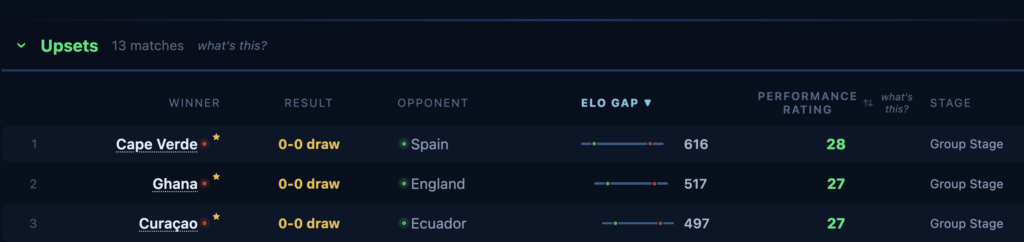
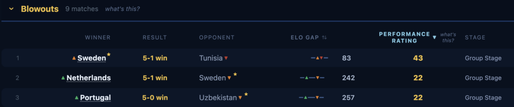
In that screen capture, note that in addition to the performance rating – which, again, is the change in the ELO rating for the underdog – I show the “ELO Gap” which represents the difference between the ELO ratings for the two teams.
Team Performance
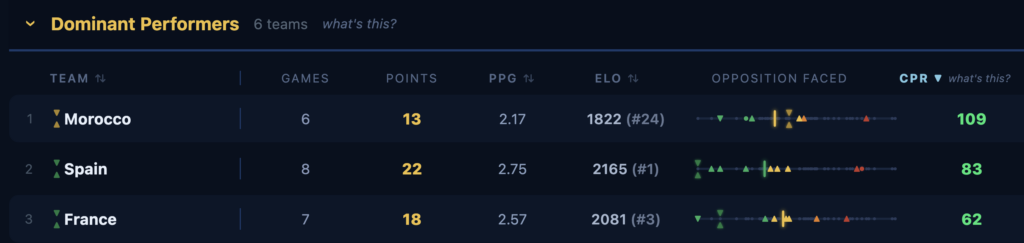
Armed with the match performance, computing a team’s overall performance is trivial: I just sum the performance scores for each match played, producing what I call the “Cumulative Performance Rating” (CPR). However, for this computation the winner always receives a the positive performance rating value, while the loser receives the negative value. This means that a high performing team will have a high, positive value, and a low performing team will have a low, very negative value.

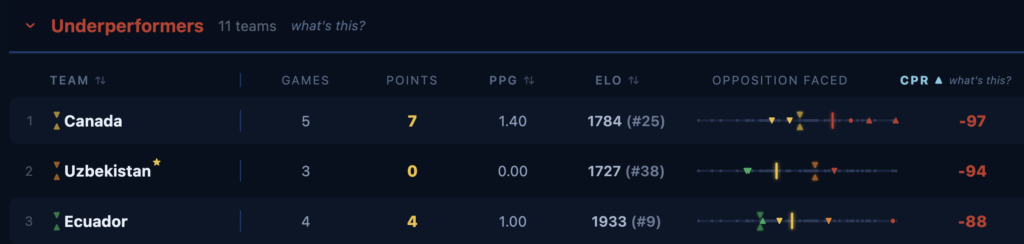
We can see that losing to weaker opposition represents worse performance (#25 Canada lost to #16 Switzerland and #24 Morocco, and tied #66 Bosnia and Herzogovia; #38 Uzbekistan lost to #5 Portugal, #7 Columbia, and #54 DR Congo). Ecuador’s performance score shows that winning against closely matched opposition does little to compensate for losing to weaker te – or tying a much weaker Curaçao (ELO gap between Ecuador and Curaçao is about 500 points, the fifth biggest ELO gap in the tournament).
Match Categorization: Upsets and Blowouts
So one thing I really wanted to evaluate was how many times an underdog outperformed expectations, and how many games resulted in blowouts.
Categorizing an upset requires a little subtlety. If two teams are ranked closely, neither is truly an underdog. For example, the ELO gap between Canada and Morocco is only 38 points, so even though Canada is the putative underdog in that match, had they won it would not really have been an upset. I categorize a match as an upset not just when the underdog does not lose (a win or a draw both count), but also only when the ELO gap was greater than 100. Empirically I discovered this was insufficient; many uninspired draws by an underdog were included. To remove those draws I further require a Cumulative Performance Rating greater than 20.
Blowouts are comparatively straightforward. A match is categorized as a blowout if the actual scoreline margin is four or more goals. There were nine blowouts in the 2026 world cup, all in the group stage.
Team Categorization: Under-, Over-, and Dominant Performers
So it’s clear that Spain did well in this tournament – won every game except one that they tied, only allowed a single goal, and went home with the trophy. But were they the most dominant team? Who else performed well, and who performed poorly?
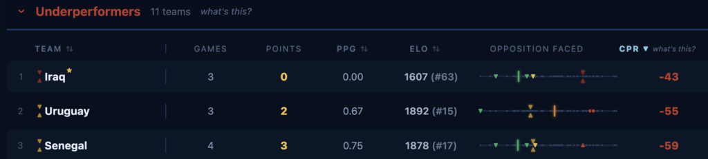
I wanted to try to evaluate these questions, but again only with the data I had in hand. The computed CPR ranges from a maximum of 104 to a minimum of -97, approximately a 200 point range; I arbitrarily chose the top and bottom 20% range (greater than 40, less than -40) as a useful baseline for evaluating the quality of their performance.
For underperformance, that was discriminating enough.
Overperformance was similarly straightforward.
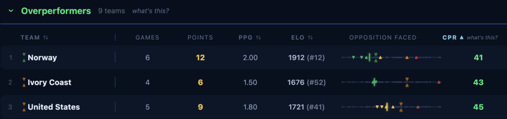
Both of these computations punish highly ranked teams perhaps disproportionately, and consequently mixed some teams with clearly superior performance (Spain, France) in amongst some weaker teams; for example, by pure CPR, both Ghana and Belgium outperformed France. To address this, I decided that an overperformer that earned more than two points per game turned in what I call a dominant performance.
Drama: how dramatic were the games?
There has been a lot of positive feedback about this year’s tournament, and for good reason. I wanted to try to quantify just how “good” the tournament was. I will admit up front that this is the weakest analysis of the lot, and what I’ve described already includes a lot of pretty raw math with unfounded assumptions. But even so, I think this analysis does reveal some interesting things about the tournament.
Soccer is, at its core, an entertainment product. If the games aren’t entertaining, they aren’t worth watching. I considered trying to evaluate entertainment value directly, but quickly decided that it would require a lot more data and whatever I came up with would be pretty suspect. So I abandoned that immediately. and recommitted to satisfying myself with another weak but not entirely fictional approximation using only the data I had on hand.
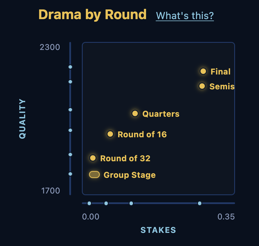
One of the particularly entertaining aspects of the World Cup – any tournament, really – is that as time passes and teams advance, two things happen in conjunction. As weaker teams are eliminated, the quality of the games gets better. However, and importantly, the stakes of each game also increase. For example, the first round of the group stage is meaningful, but losing it isn’t disqualifying. But as each round passes, the stakes increase, until the fan experience of watching their team lose a semifinal is devastating.
So I decided to try to plot the relationship of quality to drama across the rounds of the tournament. I already have the GSI to provide the measure of quality.
Evaluating the stakes took some work. My first thought was to use the probability of advancing, using a monte-carlo simulation; however, this results in a fairly boring result, since the odds of being eliminated in each game of the elimination is 50%, so the odds of reaching the final effectively simply double with each elimination round. I also explored whether framing the stakes as the genuine probability swing – that is, how the game changed the probability of advancing for the group stage, and how it changed the probability of winning the tournament in the elimination rounds. This approach is arguably more literally honest than what I finally settled on; it really is “swing in the probability of winning the tournament due to this game. However, it suffered from low and virtually indistinguishable probabilities across all the early rounds, with a dramatic parabolic jump in the semifinals. Accurate, perhaps, but not useful.
So after some experimentation, I settled on what Claude named a “banked-value” approach. We calculate each team’s independent stakes in each match with a value representing how much the result could swing their tournament fate, expressed as a 0..1 expected-value swing.
We start with a couple basic assumptions.
- STAGE_VALUE: We construct a value function for the outcome of the group stage to normalize it with the elimination rounds. We gave first place a value of 1.0; second place a value of 0.85; and a third place wild-card winner (teams that were not eliminated although being third in the group) a value of 0.4; and for those failing to advance, a nice, round zero. An elimination round win is always 1.0, and a loss zero. These values are essentially arbitrary, but at least resonate with the value of achieving them; winning the group historically has been a significant advantage – while this year’s odd format diminished that, trying to measure it deterministically was too much work).
- KNOCKOUT_VALUE: I arbitrarily assigned a value to each stage of the tournament, constructed by each team’s “share” of the total in that stage. Because stage has half as many teams, I double the value of the round. I assigned the value 64.0 for the final, inspired by the ELO formula’s use of “60” as the value of each game in the competition but rounded to the nearest power of two; then worked backwards, halving that for each stage: 32.0 for the semifinal, 16.0 for the quarterfinal, 8.0 for the round of 16, 4.0 for the round of 32, and 2.0 for the Group stage.
We start by computing a rolling ELO for each team after each match, and store the delta. Again we use the official ELO computation, but not “underdog-anchored.” We apply each team’s natural ELO – that is, the change to a team’s ELO based on the actual results.
We compute goal expectancy using values fit from the actual 2026 results. Specifically, we produce a projected goal margin based on ELO gap by regressing across the actual results for every match. (We computed 197 ELO points per goal of expected margin, with an average of 2.86 total goals/match.)
We treat projected goals for each team as independent Poisson distributions, modified by the Dixon-Coles low-score correlation correction (a small tweak that fixes Poisson’s tendency to slightly misprice 0-0/1-0/0-1/1-1 scorelines). This results in a stochastic prediction (that is, a different prediction with each iteration according to the probabilities) for the number of goals each team might score, which allows us to predict the result (win, loss, or tie). We then sum the joint distributions across each of the three results. This produces the three probabilities we are interested in for each team: the probability of a win, of a draw, or a loss.
So for each game, the engine simulates the whole remaining bracket forward many times (every subsequent round, real opponents via the historical bracket), and measures each team’s stakes as the “value at risk if you lose”: the gap between its projected haul if it wins this match vs. if it loses. This is backed out algebraically via the law of total expectation rather than a second, outcome-conditioned simulation pass. This results in the value a win in this game is likely to contribute through the tournament, which I believe correlates at least loosely to the stakes.
So that’s the methodology. There’s a ton more fun data to explore; knock yourself out!
Footnotes
- I tried a number of approaches here; I settled on this computation after a side-by-side comparison against KDE mode, Half-Sample Mode, and Shorth. ↩︎
- Because this tournament had some brain-dead organizational principles, there really was no Group of Death – three teams from any group might make it, so the whole concept is somewhat misplaced. But I thought the analysis was interesting of its own right. ↩︎
- Credit goes to my friend David Said for inspiring this line of thinking. ↩︎
- Colloquially this tournament is known as “The World Cup” but in fact the World Cup starts much earlier than that – the qualification rounds for the 2030 tournament begin in about a year across the globe. This is formally described as the World Cup Finals, as the final and most dramatic step in a very long tournament. ↩︎
This is Part 1 of a four-part series discussing the 2026 World Cup
| Part 1 Methodology | Part 2 Performance | Part 3 Tournament Structure | Part 4 A Plea to FIFA |
