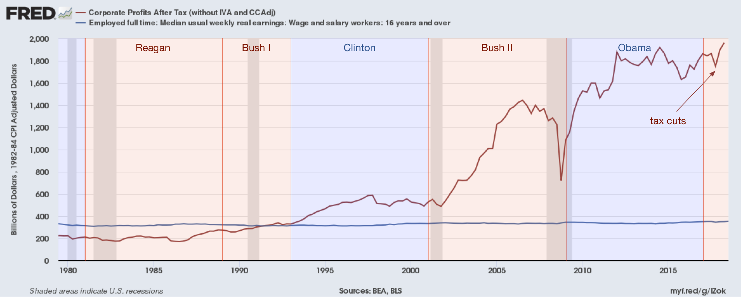
A graph is circulating on Facebook that compares wage growth vs. corporate earnings since the recent tax cut. I was curious if the data is accurate, so I did a little research. I learned two things[*]: the data is accurate, and the implication is unfair.

As this graph shows, it is true that since the tax cuts wages have been stagnant and profits have nosed up. However, it’s not clear that the tax cuts are the culprit. Wages have been flat for thirty years. Profits were basically flat under CLinton and Obama, but escalated wildly under George W.
Note: I actually learned three things: the St. Louis Fed has an incredible site for looking at economic data. If you want to play around with the data, you can find it there, along with so much other data I didn’t even start exploring yet. Data… yummy!
